Emotional Layers of Wear: An Interview with SLM Art Director, Denise Weber
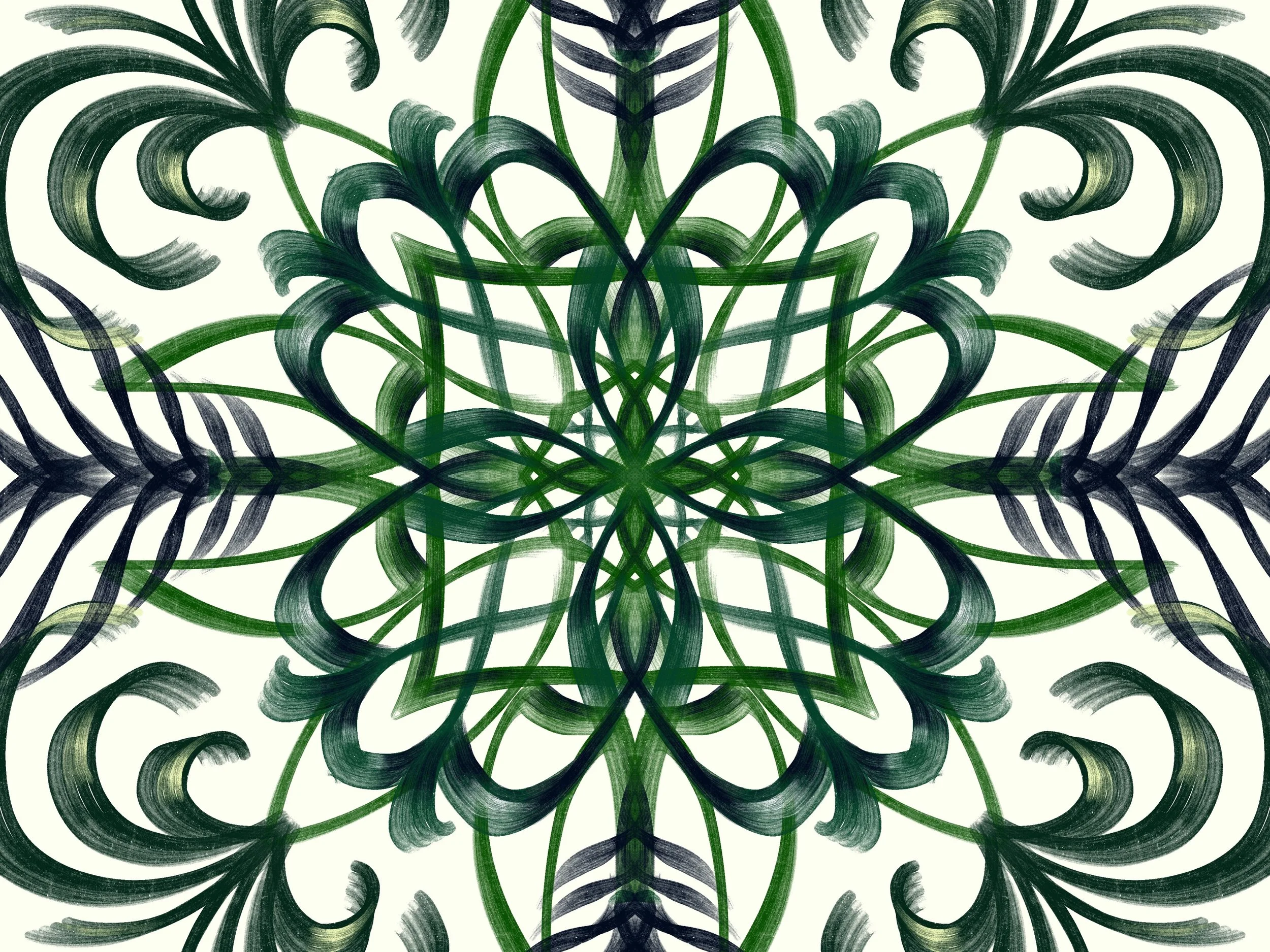
Denise Weber, “Safari”
One of the people I most wanted to interview in our 10-year-anniversary celebration series is Denise Weber, our Art Director. So much of the work she does for Split Lip is “behind the scenes” and “off camera” that you might not know about all she does for the #SplitLipFAM. But I want you to get to know her! She is wildly creative, incredibly insightful, and an all-around good person.
Denise has been with the magazine since 2017—half of its history—and has had a tremendous impact on our journey. Her vision has dramatically shaped not only the look of our mag but also our mission and who we are as an organization. Denise has designed our logo, our new and improved website (along with former web editor Leta Keane), our print issues, and our swag. (Have you seen our awesome swag??? Look out for more soon!) Denise selects all our cover art for print and web, carefully reading all the words in each issue to pick images that are in conversation with and elevate the written content. Publishing work by new and diverse artists is a big priority to her. She has also overseen the migration of content from our legacy site to our new one—an enormous, time-consuming job involving help from many staff members and archival assistants. Finally, she is constantly brainstorming how to make our process better, cool ideas for the magazine to pursue, and, more recently, plans for our Tenth Anniversary Issue. (More on that soon!)
Denise is a self-taught graphic designer, living in Northern California, whose love for letterforms grew alongside her love for words. She can often be found outside creeping on bugs and lizards, or inside making fermented goodies and other potions. We talked over Slack about art, Goldfish crackers, ASMR, and a secret fear.
Maureen Langloss: You have been at SLM for a long time now! Half a decade! Under your leadership as Art Director, the art in the magazine has really grown and flourished. Can you tell us a little about that journey? What has changed about the selection process and the submissions you see in the queue?
Denise Weber: A lot has happened with SLM in those five years! SLM began publishing art from its inception in 2012 through 2015, and you can now find these pieces in our archive. Go have a look, they’re pretty terrific! The magazine resumed publishing art in 2017 as part of its metamorphosis into the form it maintains today. When I joined SLM as art director, I was concurrently a poetry reader, and my time with the mag was largely divided between reading poetry and working on various design projects. I didn’t start managing art submissions until late 2018.
Compared to then, we’re currently getting about twice as many submissions a year but we’re looking at way, WAY more artwork. There are a number of reasons for this, but a key one is that we now encourage artists to send a portfolio link rather than just a single uploaded file. Before, we were getting a lot of work that just wasn’t quite what we were looking for. But if something had a spark, I would seek out and pore over the artist’s portfolio. Very often I would ask if we could publish something different than what they’d uploaded to the submission form. There was a lot of Googling and a fair amount of soliciting in my first year or two of handling submissions! Now that we have a greater wealth of art to choose from, we’ve brought on additional staff (our wonderful new curators, Allison Weissman and Annie Brinich) to help find portfolio standouts and debate potential acceptances.
Another thing that now influences our art selections to a degree worth mentioning is our website. Our homepage presentation changed drastically when we moved from Wix to Squarespace in 2019. I consider the website as a contextual element of the issue’s design and think about how the cover art, featured texts, and accompanying GIFs might play together. (Side note: these GIFs are selected by our brilliant web editor, Amanda Schroeder!)
ML: What artwork tends to catch your eye? What do you think makes a work of art stand out for possible inclusion in SLM?
DW: The pieces that stand out the most to me have an evocative subject with a strong composition and a fresh point of view. They are often playful or daring while also being approachable and accessible. We don’t get many sculptural or textile art submissions, so when we do those tend to catch my eye just because they’re uncommon. And there’s a lot of work I admire that doesn’t fit within the mag’s aesthetic … I often find myself drooling over cool editorial photography and clever graphics, but generally this isn’t what we publish at SLM. Some genres don’t lend themselves well to the emotional layers of wear that I’m really looking for.
That said, I love having my assumptions and preconceptions challenged, and some of the strongest works of art are the ones that nudge the boundaries of a genre or medium or style in an unexpected way. For example, I never would have thought I’d consider food photography for a cover, but in Tiffany Mi’s “Sunbathers” each tomato shines with an exuberance that’s utterly transporting/transforming. I want to be in that pool of water glowing with them in that incredible sunlight.
ML: Oooooh. Me too! “Sunbathers” is a visual delight. How did Tiffany Mi make those tomatoes so damn sexy? (Also, I’m seeing a theme in these interviews because last week assistant poetry editor CD Eskilson told us that cherry tomatoes are their fave snack.) I love hearing how the art in our queue challenges your assumptions. Has your view of what makes compelling art changed over the last five years of working at SLM? If so, how?
DW: I have to say yes because as objective as I aim to be, editing is always subjective and although I’m not always thinking about how my taste has changed, of course it has. It’s probably safe to say I am currently very into certain colors/combinations and therefore those colors are compelling to me as an editor, but palette alone is not going to make a submission stand out … it has to tick multiple boxes for me.
Taste aside, things that were once fresh can get old as trends arrive, have their moment, and sometimes linger awkwardly past their exit line. One of the great things about the diversification within our queue is the varied perspectives and approaches to art that come from different lived experiences, all of which ultimately contribute to the voice-driven type of work we’re looking for.
ML: Aside from the SLM art you publish, what else delights you these days?
DW: I listened to ASMR [Autonomous Sensory Meridian Response] for the first time recently, and while I don’t get the tingles some people get, it gave me a surprising and lovely awakening to the subtle, everyday sounds that I’m usually not attuned to IRL.
ML: Cool! You’re inspiring me to try it too. Now it’s your turn to answer the question I asked CD, what is your favorite snack food and why?
DW: I really love this question but I’m struggling to answer it! According to my mom, toddler me always had Goldfish crackers or string cheese and grapes in hand. YA me was all about barely-ripe bananas, because they have a tangy-floral/tropical flavor and a firmer bite that doesn’t immediately turn into mush in your mouth. Mid-30s me is embarrassed to admit that Kirkland Signature Nut Bars (Costco’s version of a KIND bar) are my snack of choice. I carry a small/growing amount of guilt about this because I hate the waste of single-serve packaging, plus almonds are a prevalent ingredient and almond farming is problematic … but I’m constantly reaching for them because they’re tasty and chewy and filling and convenient and really the perfect three bites. I take big bites, don’t judge.
ML: Yum! No judgment here! I’m all for big bites. Before we end, you told me a secret fear off the record while we were discussing this interview. Might you share it with our SLM readers?
DW: I am terrified of taking up space and being seen. But I am so thankful and happy to be doing this interview with you!
ML: I am thankful and happy too. I find this fear so poignant, because your job at SLM involves helping other artists take up space and be seen. I think many artists and writers can relate to this anxiety. And in the spirit of taking up more space and being seen, I’d like to share Denise’s own vibrant, intricate, and beautiful art, which you can find on her Instagram (@_type_d). Also, please enjoy Denise’s digital piece entitled “Safari” at the top of this interview. I could stare at this artwork for hours finding all the many emotional layers of wear.

